Define form properties
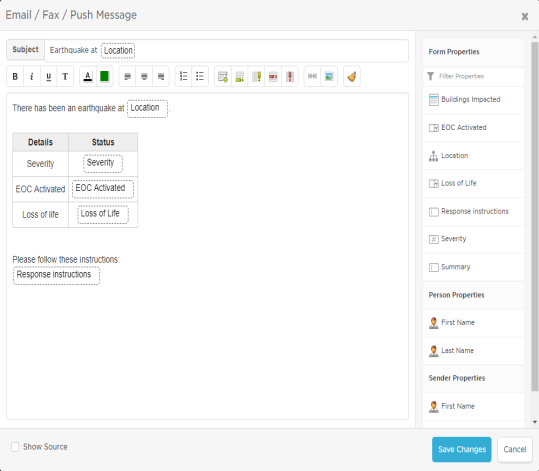
The Properties tab allows you to create properties such as Boolean check boxes, option lists, and number selectors that can then be added to forms and messages, including the Subject line of email notifications. Properties can be used only within the workflow for which they were created.
When you insert a property into a message, its configured value replaces the property name when a form is initiated. For example, if you add a text property to your messages named tollFreeNumber and its default value is 1-800-555-5555, this value replaces the property name wherever it appears when the form is sent.
If the phone number later changes to 1-800-555-1212, you can simply change the default value of the text property, rather than changing every instance of the property name in your workflow. The message sender can also change this value if required when initiating the message, and this modified value is then inserted when the message is sent.
The workflow builder also includes special predefined properties that allow you to personalize your notifications.
Once a property is added to a form, it can also be used by steps in a flow built off that form. For example, you could use a Boolean "customer impacting" property to automatically decide which step to take next or use an "Issue details" property to populate a step that creates a ticket in your service desk application.
Only properties that have been added to the form in the Layout tab are available when sending a message in the Messaging tab. You also need to add properties to the Layout for them to be available to flows based on the form.
The following screenshot shows the key elements of the Properties tab:
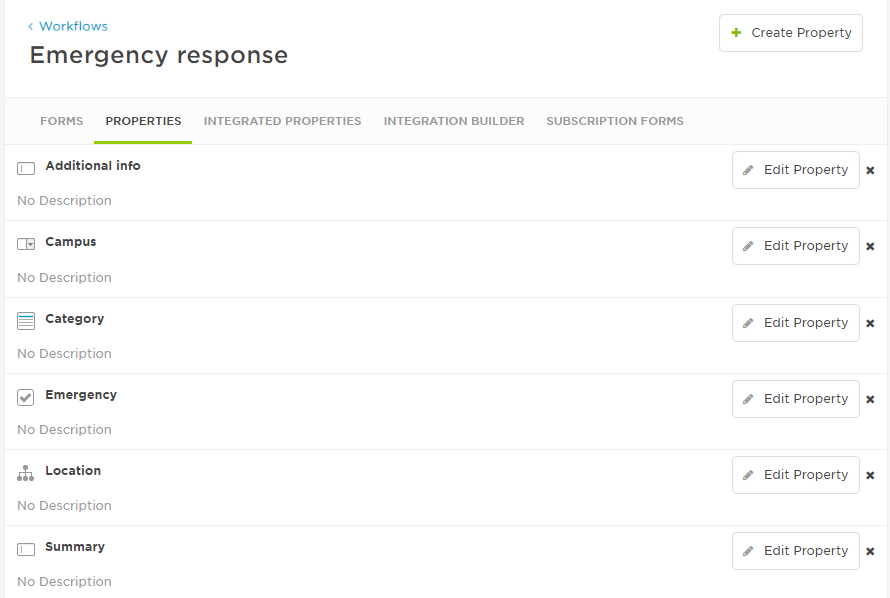
- On the Properties tab for the workflow, click Create Property.
- Click the property type that you want to add and then click Next.
- Specify the settings for the property.
- Click Create Property.
You can rename or change the default values of existing properties, as long as the property is not used in a flow.
To modify or rename a property:
- On the Properties tab for the workflow, click the Edit Property button next to property name.
- Modify the property.
- Click Save Changes.
- You cannot rename a property used in a flow because this would break the flow. To rename the property, check the Usage tab and remove the property from wherever it's used.
Renaming a property may cause it to be removed from messages that have been scheduled to be sent in the future.
You can delete a property to remove it from your workflow.
You must manually remove the property from any messages where it is being used before you can delete it. This prevents anyone from unintentionally affecting the content of email, fax, text, or voice messages.
To delete a property from a message:
- Click the Messages tab of the form editor to access the message editors.
- Click Edit to view the content for each message type and delete the property from any of the messages where it is being used.
- Remember to click Save Changes after editing each type of message.
To delete a property from a workflow:
On the Properties tab for the workflow, click the x next to the property name.
If the property is used in a flow, you can't delete it since this would break the flow. If you try to delete it, and message appears, telling you where it is used. Remove it from those flows then return here to delete it.
Deleting a property may cause it to be removed from messages that are scheduled to be sent in the future.
Add properties to forms and messages
Once you have created a property, it will appear in the Properties area on the form designer and the message editors. Note that properties can be used only once on forms (but multiple times on messages).
Add a property to a form by dragging it to an existing custom section (you can also reorder it by dragging-and-dropping it).
Remove the property from the form by clicking its red X icon.
You need to manually delete the property from any messages where it is being used before you can delete it from the form layout. For more information about deleting properties from a message, see Delete a property.
If the property is used in a flow, you can't delete it since this would break the flow. A message tells you where it is used. Remove it from those flows then return here to delete it.
Once you've added a property to a form, you can click the Settings icon (the gear icon) to adjust property-specific settings:
- Toggle whether the property is mandatory by selecting or clearing the Required check box.
- Modify property details by selecting Edit Property.
- For text properties, control whether multi-line formatting is used by selecting or clearing the Multi-Line check box.

Drag it to the desired location on the message (you can also move it again by drag-and-drop).
Boolean properties
A Boolean property allows you to specify default values of True, False, and None. For example, you might create a Boolean property named Emergency with a default value of False, which you then add to a custom section on a form. This allows the message sender to indicate whether this situation is an emergency when initiating the form.

Here's how this example property appears to the message sender:

When you send a message, the value is sent behind the scenes in lowercase: true, false, none. This is important to keep in mind if the property is used in Flow Designer (for example, in a switch step or sent by a webhook step to another system that's particular about its capitalization).
To define the property, specify the following details and then click Create Property or Save Changes:
| Setting | Description |
|---|---|
| Name |
Name of the property displayed in email, text, and push messages. |
| Default Value |
Initial value for the setting (None, True, or False). This is the value first presented to the message sender viewing the form. |
| Description |
Optional descriptive text that appears beside this property in the list on the Properties tab. You can use this to explain anything about the property that other workflow designers might find useful - it isn't shown to message senders or recipients. |
| Help Text |
Text that appears on the form below the setting that's intended to help the message sender understand the intention of the property setting (supports limited HTML). Although this value is not mandatory, it should be used when the setting is potentially complex, or requires specific explanation to clarify its meaning in the context of the form. |
List box properties
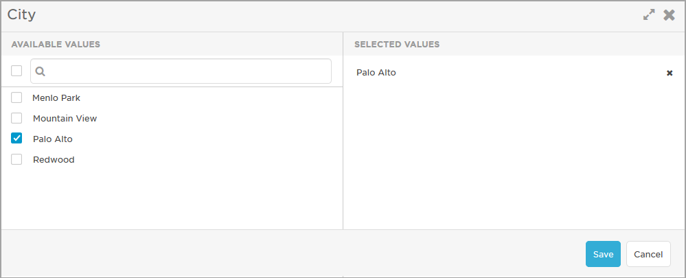
A list box allows a message sender to select one or more values from a list the form designer has defined. For example, a list named City might include the values Menlo Park, Palo Alto, Mountain View, and Redwood City.

If you set a default value or values for the list, the message sender sees them listed as shown below:

The message sender can select any or all of the defaults in the list, delete the default values, or click Edit Values to select values other than the defaults.
If you do not set a default value, the message sender can click Add Values and select values from the list of available options. The user can search for values, select and deselect all values, then save their choices.
To define the property, specify the following details and then click Create Property or Save Changes:
| Setting | Description |
|---|---|
| Name |
Name of the property displayed in email, text, and push messages. |
| Description |
Optional descriptive text that appears beside this property in the list on the Properties tab. You can use this to explain anything about the property that other workflow designers might find useful - it isn't shown to message senders or recipients. |
| Help Text |
Text that appears on the form below the setting that's intended to help the message sender understand the intention of the property setting (supports limited HTML). Although this value is not mandatory, it should be used when the setting is potentially complex, or requires specific explanation to clarify its meaning in the context of the form. |
| Values |
Allows you to specify the values of the options that will appear in the list box. Each line represents an option; if you want a value to be selected by default when the form is viewed, add an asterisk after the value. For example, the following is a valid list with a default value of ValueD: Value1
Note: values will appear in the drop-down list in the order specified. |
| Sort Alphabetically |
If you want to ensure that list values appear in alphabetically order, click Sort Alphabetically. For example, the list shown in the description of Values above would appear as follows after sorting: Value1
|
Combo box (drop-down list) properties
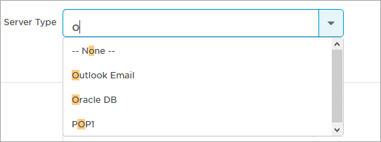
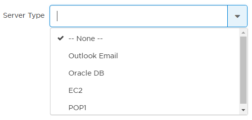
A combo box (or drop-down list) allows a message sender to click the list or type to search, and then select one of the values that the form designer has defined. For example, a list named Server Type might include the values Outlook Email, Oracle DB, EC2, and POP1.

Here's how this example appears to the message sender when they search for a combo box property:
To define the property, specify the following details and then click Create Property or Save Changes:
| Setting | Description |
|---|---|
| Name |
Name of the property displayed in email, text, and push messages. |
| Description |
Optional descriptive text that appears beside this property in the list on the Properties tab. You can use this to explain anything about the property that other workflow designers might find useful - it isn't shown to message senders or recipients. |
| Help Text |
Text that appears on the form below the setting that's intended to help the message sender understand the intention of the property setting (supports limited HTML). Although this value is not mandatory, it should be used when the setting is potentially complex, or requires specific explanation to clarify its meaning in the context of the form. |
| Values |
Allows you to specify the values of the options that will appear in the drop-down list. Each line represents an option; if you want a value to be selected by default when the form is viewed, add an asterisk after the value. For example, the following is a valid list with a default value of ValueD: Value1
Note: values will appear in the drop-down list in the order specified. |
| Sort Alphabetically |
If you want to ensure that list values appear in alphabetical order, click Sort Alphabetically. For example, the list shown in the description of Values above would appear as follows after sorting: Value1
|
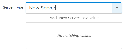
A message sender can add custom values to a combo box or drop-down list property in addition to the values the form designer provided. In our Server Type list example, the message sender can add additional server types to the drop-down list.
Allow message senders to add and save custom values to your combo box
Click on the Settings icon (the gear icon) beside the combo box property to access its property-specific settings.
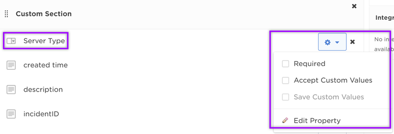
- Accept Custom Values: Selecting this option allows message senders to add their own custom values to the form or scenario when they fill it out. Unless Save Custom Values is also selected, any added custom values are only available on the instance of the form or scenario in which they were added. This means that future message senders need to re-add custom values to the combo box property the next time they send a form or scenario.
- Save Custom Values: To enable this option, you must first select Accept Custom Values. Selecting this option permanently adds custom values to the combo box property. This means that if you add the property to another form or scenario in the same workflow, the saved custom values can be viewed and selected. You can delete any saved custom values in the form designer or message editor if they are no longer needed.
- You can only add custom values to a combo box property in a scenario if both Accept Custom Values and Save Custom Values are enabled for that property.
Add custom values as a message sender
To add custom values in a form or scenario:
- Go to the combo box or drop-down list property you want to add a value to. Let's use the Server Type list example.
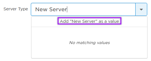
- In the property field of the property, type in the value you want to add. (e.g., "New Server")
- Click Add "Your Custom Value" as a value or hit Enter on your keyboard. (e.g., Add "New Server" as a value)
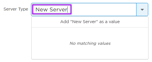
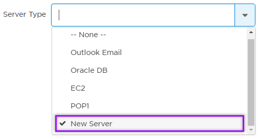
Your custom value is now part of the combo box list. You can select this option and have it appear in the notification you send to recipients.
Hierarchy properties
You can use a hierarchy property to create a series of dependent drop-down lists. This means that the choices made in higher-level drop-down lists determine which options are presented in lower-level lists.
For example, you could create a property named Region that includes two drop-down lists, labeled Country and City. In this case, once a User selects a country, the City drop-down list would become available and would be populated by cities defined for the selected country (for a more detailed example, see Hierarchy Property Example: Office Location).

To define the property, specify the following details and then click Create Property or Save Changes:
| Setting | Description |
|---|---|
| Name |
Name of the property displayed in email, text, and push messages. |
| Description |
Optional descriptive text that appears beside this property in the list on the Properties tab. You can use this to explain anything about the property that other workflow designers might find useful - it isn't shown to message senders or recipients. |
| Help Text |
Text that appears on the form below the setting that's intended to help the message sender understand the intention of the property setting (supports limited HTML). Although this value is not mandatory, it should be used when the setting is potentially complex, or requires specific explanation to clarify its meaning in the context of the form. |
| Category Labels |
Text that will appear in the form beside the drop-down list for the category. For example, a Hierarchy Property with a Name of Location might have Category Labels of Country, State/Prov, and City. |
| Delimiter |
Separator that will be automatically inserted in the Values box to assist with creating the hierarchical list. Tip: To make it easier to see the relative level of each value at a glance, use a non-space delimiter such as the pipe character or hyphen. |
| Values |
Allows you to specify the values of the options that will appear in the category drop-down lists. Each line represents an option that corresponds to a category level. For details, see the example below. |
Assume that you want to create a hierarchy property named Office Location, and that you have specified the following Category Labels in the order shown:
Country
State/Prov
City
Each of these labels will appear beside the related drop-down list on any form to which you add this property. Because the lists are hierarchical, the State/Prov drop-down list does not become available until a country is specified; similarly, the City drop-down list is not available until a state or province is specified.
Further assume that you want use the following values for each category:
- Country: USA, Canada
- State/Prov: New York, California, Georgia, Quebec, Ontario, BC
- City: New York, Los Angeles, San Francisco, Atlanta, Montreal, Toronto, Vancouver
You can think of each Category Label as a level, with Country as level 1, State/Prov as level 2, and City as level 3. You must organize entries in the Values box to correspond to each level, with the selected delimiter used to denote and separate levels. Note that top level entries are not preceded by a delimiter.
If you selected the pipe delimiter, your Values list would look similar to the following:
USA
|New York
||New York
|California
||Los Angeles
||San Francisco
|Georgia
||Atlanta
Canada
|Quebec
||Montreal
|Ontario
||Toronto
|BC
||Vancouver
To set a level 1 value as the default for the form, add an asterisk after the value (lower level values cannot be marked as default). Note that values will appear in the drop-down lists in the order specified.
The following screenshot shows how the example Hierarchy property would appear on a form, with the San Francisco office location selected:

Number properties
When it appears on a form, a number property allows a message sender to specify an integer value. A form designer can optionally configure a default value, as well as maximum and minimum values and units. For example, a property named Shipping Weight might have no default value, a minimum value of 1, and units of Lbs.

Here's how this example property appears to the message sender:

When added to a message, a number property is replaced by its specified default value when the form is initiated. This can be useful when a number is subject to change over time. For example, a property named Karen Smith - Office Number might initially have a default value of 74. If she later moves to office number 77, only the property value need to be changed, rather than all of the instances of the property in the forms.
To define the property, specify the following details and then click Create Property or Save Changes:
| Setting | Description |
|---|---|
| Name |
Name of the property displayed in email, text, and push messages. |
| Default Value |
Optional initial numerical value for the property. |
| Description |
Optional descriptive text that appears beside this property in the list on the Properties tab. You can use this to explain anything about the property that other workflow designers might find useful - it isn't shown to message senders or recipients. |
| Help Text |
Text that appears on the form below the setting that's intended to help the message sender understand the intention of the property setting (supports limited HTML). Although this value is not mandatory, it should be used when the setting is potentially complex, or requires specific explanation to clarify its meaning in the context of the form. |
| Minimum | Specifies a minimum numerical value. |
| Maximum | Specifies a maximum numerical value. |
| Units |
Text that appears as a parenthetical reference following the Name (e.g., Miles, KGs, GBs). |
Service properties
Service properties allow designers to add services to a flow trigger form. A form designer can optionally add default values—they can select existing services from the Service Catalog or type to input new values that will be added as suggested services.
For example, a service property named Impacted Services might be added to an incident initiation form.

When users initiate an incident, they can save time by accessing the Service Catalog directly on the form and quickly searching for impacted services to add to the incident. They can also type a new service that will be added as a suggested service.
To use a Service property to add impacted services to an incident, you need to add the Service property variable to the Impacted Services input in an Initiate Incident or Update Incident step in the same flow.
Here's how this example property will appear to the form sender:

Users can also add services from the existing catalog or add new suggested services when they run an automation.
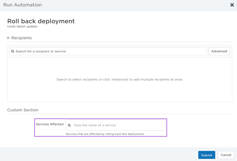
For example, a designer might add a service property named Services Affected to an automation form that rolls back a deployment. When a user runs that automation, they can add services that are affected by rolling back that specific deployment.
Service property values cannot be used as the associated service of an automation. To add an associated service, you need to open the configuration screen of the Incident Automation trigger that initiates the automation.
Here's how this example property will appear on the automation form, with additional context from the Help Text property setting:
To define the property, specify the following details and then click Create Property or Save Changes:
| Setting | Description |
|---|---|
| Name |
Name of the property displayed in email, text, and push messages. |
| Default Value |
Initial values for the property. These are the services first presented to the form sender when viewing the form. |
| Description |
Optional descriptive text that appears beside this property in the list on the Properties tab. You can use this to explain anything about the property that other workflow designers might find useful - it isn't shown to form senders or recipients. |
| Help Text |
Text that appears on the form below the property field that's intended to help the form sender understand the intention of the property setting. Although this value is not mandatory, it should be used when the field is potentially complex, or requires specific explanation to clarify its meaning in the context of the form. |
Text properties
Text properties allow designers to add text strings of up to 20,000 characters to messages. Designers can specify a default value and a minimum and maximum size for the field.
For example, a text property field named Additional Info might be added to a form and its related messages to allow the message sender to add any current information that will help notification recipients understand the situation.

When a text property is added to a message, its value replaces the property when the form is initiated. For example, if you add a text property to your messages named tollFreeNumber and its default value is 1-800-555-5555, this value will replace the property name wherever it appears when the form is sent. If the phone number later changes, you can simply modify the value of the text property, rather than changing every instance of the property name in your workflow (of course, message senders can also change this value when initiating a form).
Here's how the latter example property appears to the message sender:

A subset of HTML tags can be used to format text properties in email notifications. For more information, see HTML in text form properties.
To define the property, specify the following details and then click Create Property or Save Changes:
| Setting | Description |
|---|---|
| Name |
Name of the property displayed in email, text, and push messages. |
| Default Value |
Initial value for the setting. If you plan to use the form for alerts that tend to start with similar message text, you can use this field to specify text that will help guide the user launching the form. Multi-line formatting is enabled by default for text properties. To turn off multi-line formatting, clear the Multi-Line option in the property's settings on the form layout. For more information about configuring the settings of properties on the form layout, see Property Settings.
Note: If the Validate option is selected, Default Value must conform to the specified pattern. |
| Minimum Size | Specifies a minimum number of characters that must be typed. If this value is 0, the User launching the form is not required to add any text. |
| Maximum Size | Specifies the maximum number of characters that can be typed, up to 20000. Text properties with a Maximum Size setting of 30 or fewer characters are automatically displayed as single-line fields; higher character counts are automatically configured as multi-line fields. |
| Description |
Optional descriptive text that appears beside this property in the list on the Properties tab. You can use this to explain anything about the property that other workflow designers might find useful - it isn't shown to message senders or recipients. |
| Help Text |
Text that appears on the form below the setting that's intended to help the message sender understand the intention of the property setting (supports limited HTML). Although this value is not mandatory, it should be used when the setting is potentially complex, or requires specific explanation to clarify its meaning in the context of the form. |
| Validate |
Determines whether to apply validation to the text field, based on regular expressions. If selected, the following settings become available:
|
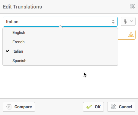
Text properties are displayed as unilingual or multilingual on the message form. If more than one language is configured for a company, each text property is displayed as multilingual. This provides message senders with the option to define alternative messages for languages other than the company's default language.
For more information on working with multi-language text fields when initiating a form or creating scenarios, see Configure message content for a text field.
Password properties
Password properties allow you to add encrypted passwords to forms. Designers can specify minimum and maximum character counts (up to 255 characters), as well as whether to use field validation.
For example, assume that a third-party system needs to be updated for integration purposes but requires a user's credentials (including password) to call the third-party web service. In such cases, the required password value can be stored as a password property within a form.

When a password property is added to a message, its value replaces the property when the form is initiated. For example, if you add a password property to your messages named Emergency Conference Password, the value specified for the property will replace the property name wherever it appears when the form is sent.
Here's how the latter example property will appear to the message sender:

Security Considerations
Password properties are intended only to obscure passwords from casual inspection. This means that they will:
- Be masked on forms when entering a value.
- Remain encrypted while in transit to and from the integration agent.
However, through configuration or administrative permissions, it is possible to:
- Send passwords out as plaintext.
- View plaintext password values on the Alerts > Properties report.
- Manually log the contents of a password field.
- Retrieve the plaintext password value using the xMatters REST API.
Technical Context
xMatters users' passwords are stored in the xMatters database and encrypted using a one-way hash. By contrast, password property values must be stored using a symmetric cipher so xMatters can submit plain-text passwords to third-party systems and include plain-text passwords in notifications. As a result, a determined attacker could potentially retrieve password values from password properties.
To define a password property, specify the following details and then click Create Property or Save Changes:
| Setting | Description |
|---|---|
| Name |
Name of the property displayed in email, text, and push messages. |
| Minimum Size | Specifies a minimum number of characters that must be typed. |
| Maximum Size | Specifies the maximum number of characters that can be typed, up to 225. |
| Description |
Optional descriptive text that appears beside this property in the list on the Properties tab. You can use this to explain anything about the property that other workflow designers might find useful - it isn't shown to message senders or recipients. |
| Help Text |
Text that appears on the form below the setting that's intended to help the message sender understand the intention of the property setting (supports limited HTML). Although this value is not mandatory, it should be used when the setting is potentially complex, or requires specific explanation to clarify its meaning in the context of the form. |
| Validate |
Determines whether to apply validation to the text field, based on regular expressions. If selected, the following settings become available:
|